Volatility is often cited but seldom quantified for many economic series. Over the years, we have sought to provide a perspective on this concept in many investment decisions. One primary lesson we have learned is that when we provide a context for the concept of volatility, decision making is improved.
John E. Silvia, Chief Economist
Wells Fargo Securities, Economics Group, Special Commentary, April 23, 2013
Step One in Analyzing Any Economic Series: Look at the Data
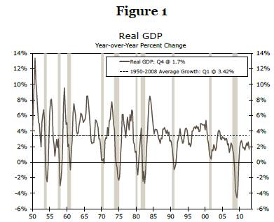
A simple, but important, way to begin the analysis of any economic or financial variable is to plot the data against time. For instance, Figure 1 compares the year-over-year change in GDP growth against its long-run average (1).
A plot of a time series provides a visual look at the data. This should be the first step of any applied time series analysis because this step allows the analyst to identify any unusual aspects of the data series.A plot shows whether the series contains an outlier—one or more extreme values in the time series—which impacts calculations such as the mean or standard deviation. An analyst should attempt to understand the reason for such an extreme value, such as an unusual event or simply a misprinted value that should be corrected in subsequent releases.
Source: U.S. Department of Commerce and Wells Fargo Securities, LLC
Second, a plot may also provide evidence to suggest whether the variable of interest contains an explicit time trend or a cyclical pattern. Third, a plot may also provide a visible indication of a structural break in the time series. A structural break suggests that the model defining the behavior of the variable of interest, such as the unemployment rate, is different before and after the break.
Figure 1 indicates that the real rate of U.S. economic growth does not contain a substantial outlier or an explicit time trend. However, a cyclical pattern is evident in the real GDP growth rate, as it tends to fall during recessions and rise during the early phase of recoveries. By adding the longrun average growth rate—3.4 percent during the 1950-2008 period—as a dotted line, it is clear that the pace of growth in this expansion has changed markedly. For instance, during the 1960s and 1970s, real growth during expansions tracks above the average long-run growth rate, while since the mid-1980s, growth has trended lower than the long-run average.
Putting Simple Statistical Measures to Work
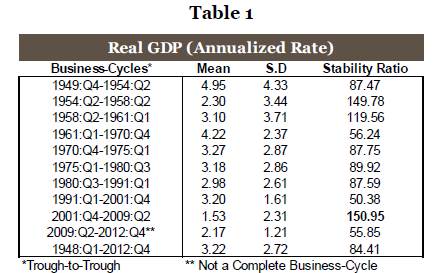
Another way to characterize an economic or financial variable is to estimate its mean (the central tendency of a data series), standard deviation (how much deviation exits from the mean) and stability ratio—the standard deviation as a percentage of the mean. A time series can be divided into different periods when it appears that the series has changed and then the mean, standard deviation and stability ratio estimated for each sub-sample. We can also test if the mean is statistically different between periods. The data series can be divided between different business cycles, different decades or even different eras, such as pre- and post-World War II.
Here we compare the real rate of GDP growth during different business cycles. We separate the data into the dates corresponding with those business cycles, as seen in Table 1. For real GDP, the mean (average) growth rate varies significantly over different business cycles with fairly rapid growth in the 1958-1980 period and then a much more modest growth rate in the period since 2001. Yet the standard deviation, one measure of variability in the series, also moves quite a bit during these decades. One major benefit of dividing this data into different eras and then calculating the mean, standard deviation and stability ratio for each era is that it reveals how differently the rate of economic growth behaved during each of these economic cycles and thereby assists us in putting growth into some context for assessing volatility.
Source: U.S. Department of Commerce and Wells Fargo Securities, LLC
As shown in Table 1, the mean growth rate for GDP between 1948 and 2012 period is 3.22 percent, with a standard deviation of 2.72 and a stability ratio of 84.41 (the standard deviation is 84 percent of the mean). The stability ratio represents the volatility of real GDP growth in each era, where a higher value of the stability ratio is an indication of more volatility. One benefit of the stability ratio compared to the standard deviation is that it identifies the magnitude of the difference in volatility of real growth by era compared to a benchmark average growth rate. For instance, if we set the stability ratio as the volatility criterion, then the 2001:Q4-2009:Q2 period stands out as a period of low, but relatively volatile growth. In contrast, the decades of the 1960s through 1980s were a period of better growth and more stable economic performance. From our viewpoint, the standard deviation alone is not the best measure of volatility, and we would prefer the stability ratio to give us a sense of balance between growth and its relative variability. The stability ratio includes the mean and standard deviation and gives us information about which sub-sample has a higher standard deviation relative to the mean for growth and therefore better identifies which time series is more volatile.
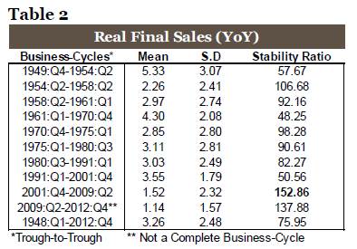
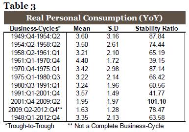
Tables 2 and 3 provide detail on the behavior of two other aggregate economic series, real final sales and real personal consumption. In both cases, we find that the 2001-2009 business cycle is the most volatile and the average growth rates of real final sales and real personal consumption were both below their long-run average. These results reinforce the view that households and businesses are less confident today than in prior economic periods. Unease at the household level is reinforced by the observations we can quantify with the data.
Source: U.S. Department of Commerce and Wells Fargo Securities, LLC
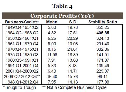
Corporate Profits
Recent commentaries have noted corporate profits as recording an outsized performance compared to the past, and the analysis here suggests that profits growth has indeed been stronger than the long-run average. However, note that the current cycle has not yet been completed, and profits growth tends to moderate further into the business cycle. As illustrated in Table 4, corporate profits growth in the 2001-2009 cycle averaged 6.40 percent, which was below the average of 7.95 percent in the 1948-2012 period. Moreover the volatility of these profits, measured by the stability ratio, is above that of the average of the long-run average. The fastest pace of growth for profits appeared in the 1975-1980 period of high inflation, while the most volatile period appeared to be the 1954-1958 period.
Source: U.S. Department of Commerce and Wells Fargo Securities, LLC
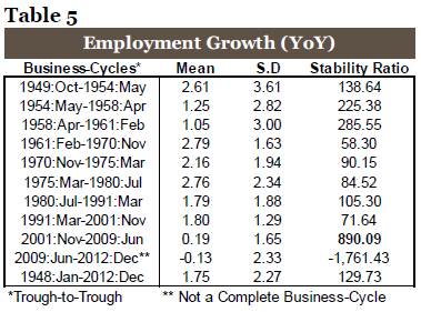
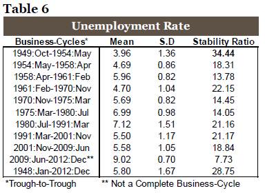
Focus on the Labor Market Using Monthly Data
Tables 5 and 6 provide detail on the behavior of two measures of the labor market that are highlighted in private strategic planning and in public policy, employment growth and the unemployment rate. For employment, the most recently completed business cycle of 2001-2009 has been the weakest period of average job growth as well as the most volatile, based on the stability ratio. Moreover, by both labor market measures, we can appreciate the challenges to household confidence and public policy in that today’s labor market is truly different than in the past. These results reinforce the view that careful analysis of the data provides value in our evaluation of the economy and helps explain the disappointing sentiment expressed by many in the current environment.
Source: U.S. Department of Labor and Wells Fargo Securities, LLC
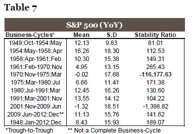
Financial Market Volatility: Assessing Risk
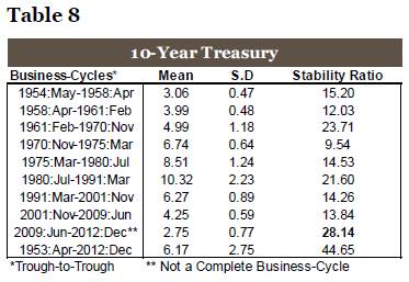
For financial markets, risk is often measured by volatility. Tables 7 and 8 show calculations for volatility in the S&P 500 Index and 10-year Treasury yield, two financial benchmarks. For the S&P 500, we find that the previously completed business cycle of 2001-2009 has been the worst period for average S&P performance since the early 1970s when rising oil prices, rapid inflation and high interest rates plagued the economy. Moreover, the volatility of the 2001-2009 period is also quite high. The 1970-1975 period, however, remains the most volatile period for the S&P 500 index. The 1970-1975 and the 2001-2009 periods were characterized by disappointing performance relative to the average gain of 8.4 percent over the 1948-2012 period as well as a much higher level of volatility. Both were periods of weak equity market performance and a difficult period for household wealth and confidence.
Source: Standard & Poor’s, Federal Reserve Board and Wells Fargo Securities, LLC
Conclusion
These simple and easily applied techniques provide useful information and enable an analyst to observe the basic behavior of a time series over different periods or business cycles. An analyst can use Excel to plot the series and to calculate the mean, standard deviation and stability ratio. SAS software can also help to estimate a mean, standard deviation and stability ratio.
(1) We examine the real GDP series here since it is the primary measure of economic success and a benchmark. The series is seasonally adjusted and an annualized quarterly growth rate is employed here in the analysis. Shaded areas represent recessions declared by the National Bureau of Economic Research (NBER).