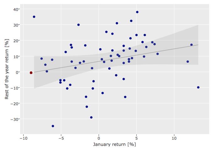
Accoring to Wikipedia the January barometer is the hypothesis that stock market performance in January predicts its performance for the rest of the year.
Below is a scatter plot for the S&P 500 January barometer with data ranging from 1951 to 2016. Each blue point represents a year with the January return on the x-axis and the rest of the year return on the y-axis. The grey line and shaded area represent the regression line and the 99% confidence interval for regressing the rest of the year returns on the January returns. The red point represents the forecast for 2016 based on the January barometer.
The plot is interactive, and you may get more information on mouse hover.
The following picture links you to the interactive chart of Macroquant:
Copyright © 2016 Macroquant AG. All rights reserved.